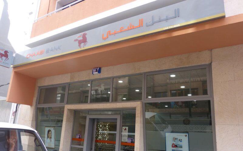
Banque Populaire Unveils Modern Logo and Digital-Focused Rebrand

The visual identity of Banque Populaire is improving with the adoption of a new logo and the implementation of a new website.
Describing its new logo, the bank indicates, in a press release, that the brand name is displayed on two lines. Thus, it gains in impact and visibility with a modern font. The historical emblem, the horse, is put into perspective by means of a circle that evokes the digital universe, in which the BCP group has resolutely engaged, the same source specifies. "This round shape also refers to the globe, a symbol of the Group’s openness to the international, now present in 32 countries around the world," the same press release from the banking institution states.
A new signature accompanies the logo: "Grow. Together". According to Banque Populaire, it reflects the bank’s entire determination to play a driving role in the sustainable development of individuals, businesses and territories.
In addition to this logo, there is a website that contrasts with the classic sites. It is available in three languages (Arabic, French and English). Moreover, it presents an optimized ergonomics and offers better access to information, for an improved customer experience. Built on four dedicated spaces (institutional, individuals, Moroccans abroad and businesses), it also relies on increased interactivity, with the possibility of sharing content directly on social networks, the same press release states.
This logo, this signature and this web portal thus embody the new dynamics of Banque Populaire at the service of the satisfaction of its Moroccan, African and international clientele, supports the same source.
Related Articles
-

Morocco’s Tourism Surge: 2.7 Million Visitors in July, but Challenges Loom for Marrakech Hotels
11 August 2025
-

Volotea Swoops In as Ryanair Exits: French Airports See Shake-up Amid Tax Hike Drama
11 August 2025
-

Moroccan Authorities Probe Student-Linked Real Estate Money Laundering Scheme
10 August 2025
-

Royal Air Maroc Boosts Brazil Connections: Casablanca-São Paulo Flights Increase to 4 Weekly
10 August 2025
-

Morocco’s Watermelon Exports to France Surge 155%, Challenging Spanish Dominance
10 August 2025